CountryWide Insurance
A redesign of a company website and gated platform for a New York based insurance company.
Role: UX Designer
Overview
Country-wide offers auto insurance to New York drivers. They are a broker-based business localized to NYC and lower Westchester County. Currently Country-wide Insurance Company (CWICO) offers its services to the 5 boroughs and Westchester.
The Opportunity
They are looking to expand to upstate NY and launch commercial and personal insurance products. Currently, the website is scattered and information is hosted in different places. How do we decrease confusion for new users trying to onboard and existing users to find their benefits?
Our Solution
A refresh of the website that needs to cater to a multicultural audience and the internal platform needed to be intuitive for all users. My team and I challenged ourselves to develop and deploy a platform experience that would allow users navigate through the system quickly.
We created a MoSCoW grid of key components that bridge user needs with business goals. Each component accomplishes certain needs and goals in their own way.
Search and Request a Quote
Engage in the Agent and Company
Set up Policy
Manage Account
Stakeholder Insights
Customers discover CWICO through broker connections. They can find a broker by zip code or through walk-ins at the brokerage centers. Customers have also just Google searched or called their local broker. When customers go directly to Country-wide, they are redirected to the designated broker for the area they are located in.
Target Audience
There are two types of drivers: preferred and non-preferred. Right before the redesign, Country-wide was up to about 40-50% preferred drivers. Normally, it was one-third preferred drivers and two-thirds non-preferred drivers. Their goal was to acquire more preferred drivers because better drivers in the database would benefit the business. The amount of preferred customers would place them on the same level as Geico, which is quite high for the industry.
New users must be able to request a quote quickly and easily. They must also be able to find contact information and quickly understand why Country-wide is a better choice for their auto-insurance needs.
Information Architecture
In parallel with the research, I evaluated the site and recreated a sitemap based on the number of screens allocated in the SOW. Following a few client meetings to understand the need and purpose of the redesign, I incorporated the most necessary screens anticipated to fulfill the must haves for the business.
User Flows
After conducting the research and analyzing the findings, we broke down the different tasks that the user needed to complete. We created user flows to show how customer can complete the tasks and ultimately, accomplish their goals.
Wireframes
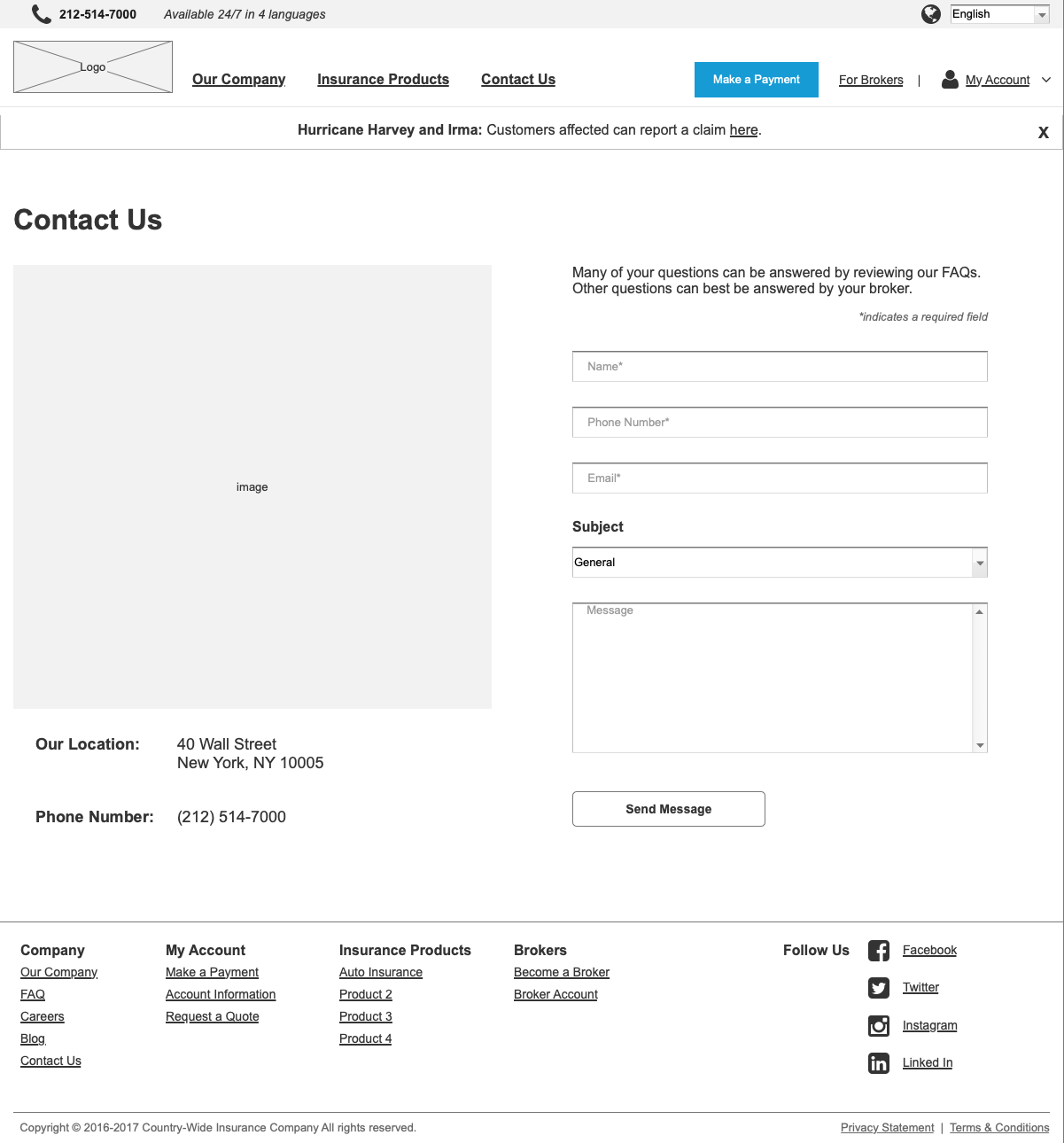
Using the user flows as guidance, I created wireframes. These wireframes were specifically created in Axure so that we could show a prototype that displayed the different interactions. After walking through the prototype with the clients, we moved on to the designs.
The redesign was successful in pilot tests because the platform
allowed existing users easily manage their profile and payments
decreased the amount of questions brokers had to answer via phone
organized the information to create a cohesive website
paved way for CTA conversion and repeated visits
reduced bounce rate with a clear navigation


